
Three Manifolds, One Signal
The URF reads structural fragility on the macro layer, the S&P 500 sector panel, and the STOXX 600 sector panel — simultaneously. Issue #1 of the weekly market reading covers what the three layers say on 1 May 2026, and what it means for US and DACH allocators.
THREE MANIFOLDS — Weekly Market Reading
Issue #1 · Sunday 3 May 2026
Macro · United States · DACH
Reading as of Friday 1 May 2026 (close) · ~1900 words · 9 min read
By Evangelos Papadopoulos · econosysmographeco.com
The reading in one sentence
On 1 May 2026, three independent manifolds — the macro layer (77 nodes across FX, rates, CPI, commodities and country indices), the S&P 500 sector panel, and the STOXX 600 sector panel — are simultaneously flagging structural fragility under the URF geometric framework. Each layer alone is a meaningful signal. The three together, with the principal-component source identified upstream and equity dispersion collapsed downstream on both sides of the Atlantic, is rare.
This issue documents what each layer reads, why the combination matters, and what it implies for institutional allocators in the US and the DACH region (Germany, Austria, Switzerland) over the Q2-Q3 2026 horizon. The DACH section includes a structural breakdown of the DAX 40 top-10 against the contagion classification — with a counter-intuitive finding worth dwelling on.
Two prices, three regimes — the framework in two paragraphs
URF works on the geometry of the covariance manifold \mathrm{SPD}(n) — the space of positive-definite matrices that captures how assets co-move. Every traded asset has, at any point in time, two prices: the spot price (what the market quotes today) and the geodesic price (what the covariance manifold structurally implies, derived from the rolling covariance trajectory and the geometric attractor of the system).
The signed gap between them, normalised by a volatility scale, is the deviation σ. The sign defines the regime: Rupture (σ > 0, spot above geodesic, structurally over-priced, mean-reversion expected); Compression (σ < 0, structurally under-priced, recovery is the attractor); Suture (σ ≈ 0, equilibrium with the manifold structure). At the panel level, an aggregate Topological Stress Score (TSS) measures the manifold’s structural integrity — high TSS means dispersion is collapsing toward a single dominant mode; very low TSS means the dispersion has already collapsed (the Singularity zone, where any perturbation propagates globally with no diversifying counterforce).
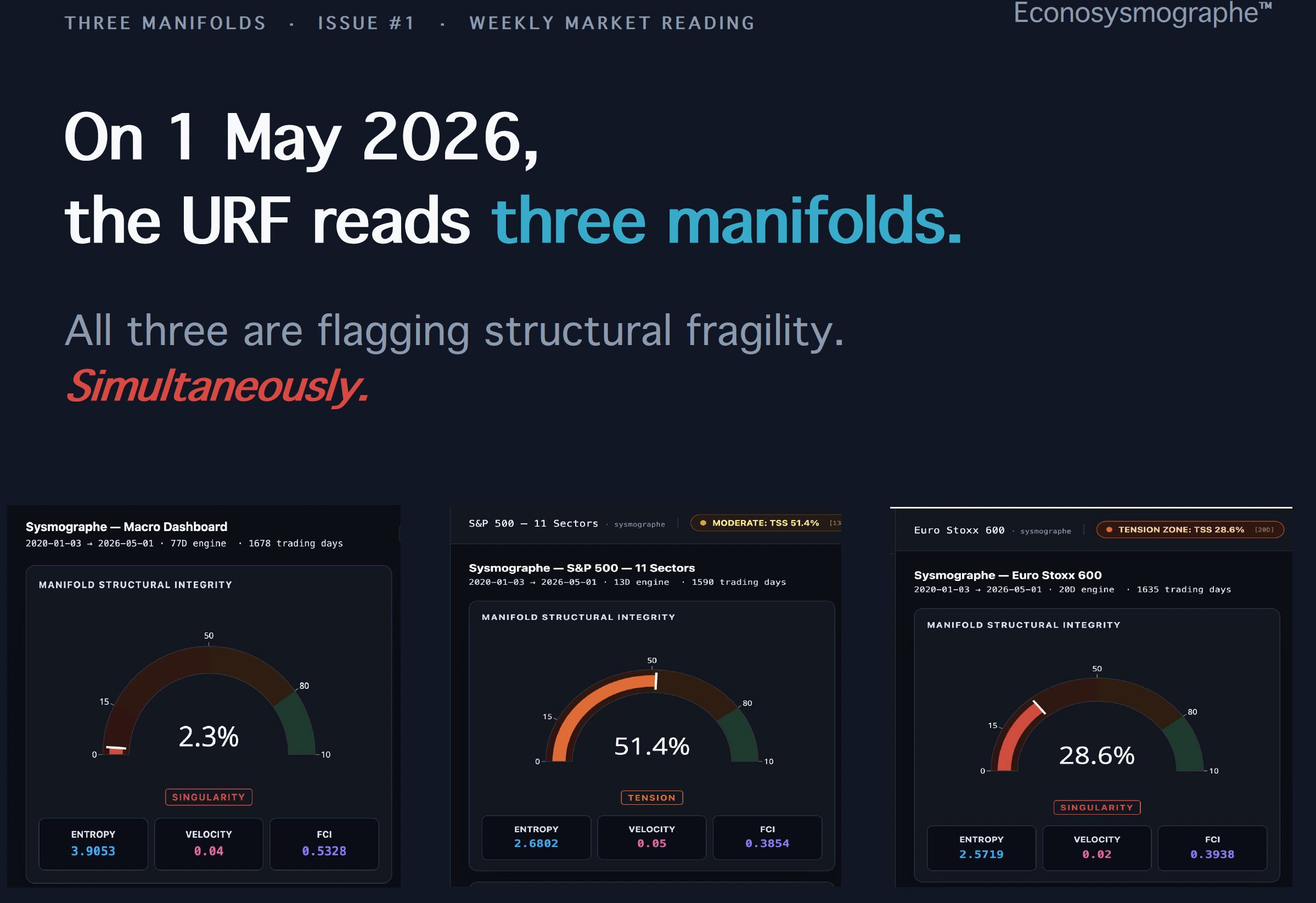
Reveal #1 — The macro manifold
The macro Sysmographe reads the broadest universe in the URF stack: 77 nodes across seven structural families — US sector proxies (11), country and regional ETFs (15), spot currencies (12), short rates 3M proxies (10), commodities and stress instruments (9), CPI and inflation series (9), and US rates and macro indicators (11). It is the layer where systemic conditions first become visible, before they propagate to equity panels.
On 1 May 2026 the macro reading is:
- TSS 2.3% — Singularity zone. The lowest score on record outside the COVID shock window.
- FCI 0.5328 — Moderate. Mean over the 1678-day sample is 0.4806; current reading is above the long-run mean, consistent with a regime under tension.
- FCI peak 0.9449 on 3 July 2020 (post-COVID rebound calibration); current FCI is at 56% of that peak.
- Entropy 3.9053, with the long-run mean at 4.2005. The drop in entropy is consistent with a manifold that is losing its dispersion — the same signature that precedes panel-wide regime shifts.
- Manifold velocity 0.04, low — the surface is moving slowly but in a structurally unfavourable direction.
The contagion network on the same date identifies USD/CAD as the visible epicenter (CORE, EMISSION), with USD/INR, USD/GBP, BR CPI and JP CPI also in the CORE ring. The induced ring contains, among others, USD/CNY, USA CPI, M2 Money Supply, and Switzerland — all of which are critical to the institutional reading. The principal component decomposition flags PC71 = US Industrial Production (IP/USA, SHORT) as the dominant factor pulling the manifold.
The combined reading is unambiguous. The macro manifold has structurally collapsed into Singularity. The source of the dominant variance is US industrial production — not Chinese growth, not European inflation, not energy. And two transmission nodes critical for our target audiences — USA CPI for US allocators, Switzerland for DACH allocators — are already in the induced ring.
The Switzerland presence in the induced ring matters specifically for DACH portfolios. Switzerland is a structural safe-haven node: when CHF flows are repricing as part of a stress propagation chain, hedging assumptions on CHF-denominated assets — and on portfolios that use CHF as a defensive overlay — are no longer benign. The induced classification is the manifold’s way of saying: Switzerland is no longer outside the stress structure. Whatever happens next, it will not stay confined to the macro layer, and DACH allocators are positioned closer to the transmission path than is typical.
In practice this week — what to look for on your own dashboards:
You will not see this signal in CDS spreads, VaR or realised volatility — they are reading calm. The fragility is upstream of realised metrics, embedded in the covariance geometry. Two specific transmission nodes are observable today on the macro contagion network: USA CPI and Switzerland, both in the induced ring. For a US risk officer, this means inflation transmission is no longer benign. For a DACH allocator, this means CHF safe-haven assumptions are being repriced from inside the stress structure rather than from outside it. Neither of these reads as alarming on conventional risk dashboards today.
Reveal #2 — The S&P 500 sector panel
The US Sysmographe reads the eleven S&P 500 sector ETFs as a connected panel. On 1 May 2026:
- TSS 51.4% — Tension zone. Above the 50% threshold that marks broad sector dispersion stress.
- FCI 0.3854 — Stable. The FCI itself is calm; what is not calm is the spread of the residuals across the panel.
- 11 of 11 sectors in Rupture regime. Zero in Compression, zero in Suture.
- Mean residual σ̄ = +24.5% above the geodesic.
- Widest gap: Communication Services (XLC) at +40.9% — spot trades 50.6% above its geodesic price. Closing the gap, all else equal, would require a −33.6% correction on XLC.
The full sector breakdown, sorted by deviation:
| Sector | ETF | Deviation σ above geodesic |
|---|---|---|
| Communication Services | XLC | +40.9% |
| Real Estate | XLRE | +29.9% |
| Consumer Discretionary | XLY | +29.5% |
| Energy | XLE | +27.8% |
| Materials | XLB | +24.5% |
| Utilities | XLU | +24.2% |
| Industrials | XLI | +22.2% |
| Financials | XLF | +20.6% |
| Health Care | XLV | +18.1% |
| Consumer Staples | XLP | +16.0% |
| Information Technology | XLK | +15.7% |
A normal market is a market of dispersion: some sectors in Rupture, others in Compression, with capital rotating between them as the manifold rebalances. Panel-wide Rupture is qualitatively different. When all eleven sectors are over-priced relative to their geodesic, the manifold itself is over-priced — the index, taken as a whole, trades above what the covariance geometry can structurally support.
The contagion network on the S&P 500 places XLE (Energy) as the principal-component epicenter (PC10, SHORT), with XLK (Tech) in the CORE ring. The widest residual deviation (XLC) and the contagion epicenter (XLE) are not the same instrument. This is the URF signature of a structurally exhausted bull regime — where the most over-priced sector is not the same as the contagion conduit, the realignment when it comes typically propagates from the conduit, not from the most-stretched name.
The historical baseline matters. The “9 of 11 S&P 500 sectors in Rupture, sustained at least one calendar month” configuration appeared three times in the modern sample (1999–2026): Q4 1999 (twelve months before NASDAQ peak), Q2 2007 (fifteen months before Lehman), and Q3 2019 (six months before the COVID shock). Subsequent S&P 500 drawdowns were −49%, −55% and −34% respectively. The average is −46%. We are not predicting that 2026 follows the same path — but the same geometric signature is on the panel today.
In practice this week — what to look for on your own dashboards:
Open the SPDR sector ETF chart for any of XLC, XLK or XLY — the price action looks unremarkable. Open the Two-Prices panel from the dashboard and the same names show structural gaps of +40.9%, +15.7%, +29.5% above their geodesic. This is the divergence the URF measures: a market that is calm in realised metrics and over-priced in structural metrics. The widest gap is XLC; the contagion conduit is XLE. A US allocator looking at their factor exposure or VaR today would see no warning. The historical analogs (Q4 1999, Q2 2007, Q3 2019) sat in this exact reading window for 6-15 months before the realised drawdown materialised — that window opened in Q1 2026 on the current panel.
Reveal #3 — The STOXX 600 sector panel · DACH allocators · DAX 40 deep-dive
The European Sysmographe reads the twenty STOXX 600 sectors as a connected panel. The STOXX 600 is the dominant institutional-grade pan-European equity benchmark, with several trillion EUR in tracked AUM across passive index funds, sector ETFs, and benchmark-aware active mandates. It is the structural reference for European multi-asset allocations and the working benchmark for institutional asset managers across the DACH region (Germany, Austria, Switzerland) for their broad European equity exposure.
On 1 May 2026:
- TSS 28.6% — Singularity zone. Unlike the S&P 500 (which is in Tension), the STOXX 600 is already in Singularity: the European panel’s dispersion has collapsed further than the US panel’s. This is a more structurally fragile reading than the headline TSS number alone suggests.
- FCI 0.3938 — Stable, with FCI peak 0.7944 on 9 March 2022 (pre-rate-hike cycle calibration).
- Entropy 2.5719, with mean 2.5086 — slightly above mean, consistent with rising heterogeneity at the sector level even as the aggregate dispersion collapses.
- Manifold velocity 0.02, very low — the European manifold is structurally locked in.
The contagion network identifies a CORE cluster of five sectors — Retail (epicenter), Basic Resources, Broadcasting, Food & Beverage, and Utilities — with the principal component decomposition flagging PC19 = STOXX600/Health (SHORT) as the dominant factor. The induced ring contains Banks, Insurance, Tech, Health, Autos, Media and Real Estate; the periphery contains Travel, Industrials, Chemicals, Telecom, Construction, Oil & Gas, Personal & Household Goods, and Financial Services.
Germany inside the STOXX 600
Germany contributes approximately 14% of the STOXX 600 by free-float market cap (most recent indexed data; subject to quarterly rebalance). This is the third-largest country weight in the index, behind the United Kingdom (~22%) and France (~17%), and roughly tied with Switzerland (~15%).
For a DACH allocator benchmarked to STOXX 600, this means the German large-cap complex enters the index alongside the UK financial complex, the French luxury and consumer complex, and the Swiss healthcare and consumer staples complex. The German weight is significant, but it is structurally less exposed to the CORE epicenter sectors than its overall weight suggests — for reasons we now examine.
DAX 40 top-10 — composition, geometric stress and contagion mapping
We mapped the ten largest German large-cap names by free-float index weight (representing approximately 55-65% of the index, varying with market valuations and the quarterly rebalance) to three URF lenses: (a) the STOXX 600 ICB super-sector classification, (b) the Papadopoulos Distance (DP) of that super-sector on the SPD(20) manifold — the URF measure of structural geometric stress — and (c) the contagion ring classification on the dashboard.
| DAX Constituent | STOXX Super-sector | DP | Contagion Ring |
|---|---|---|---|
| Siemens | Industrials | 15.59 | PERIPHERY |
| SAP | Technology | 15.66 | INDUCED |
| Allianz | Insurance | 15.92 | INDUCED |
| Siemens Energy | Industrials | 15.59 | PERIPHERY |
| Deutsche Telekom | Telecom | 20.94 | PERIPHERY |
| Airbus | Industrials | 15.59 | PERIPHERY |
| Munich Re | Insurance | 15.92 | INDUCED |
| Rheinmetall | Industrials | 15.59 | PERIPHERY |
| Infineon | Technology | 15.66 | INDUCED |
| Deutsche Bank | Banks | 16.82 | INDUCED |
Sorted by DP (highest geometric stress first), the structure becomes :
- Deutsche Telekom — DP 20.94, Telecom, PERIPHERY — single name, highest manifold stress in the DAX top-10
- Deutsche Bank — DP 16.82, Banks, INDUCED
- Allianz · Munich Re — DP 15.92, Insurance, INDUCED
- SAP · Infineon — DP 15.66, Technology, INDUCED
- Siemens · Siemens Energy · Airbus · Rheinmetall — DP 15.59, Industrials, PERIPHERY (4 names sharing the most diversified geometric position in the DAX top-10)
Aggregating by contagion ring (count of names) :
- CORE: 0 of 10 — no DAX top-10 name maps to the five CORE epicenter sectors (Retail, Basic Resources, Broadcasting, Food & Beverage, Utilities)
- INDUCED: 5 of 10 — SAP, Allianz, Munich Re, Infineon, Deutsche Bank
- PERIPHERY: 5 of 10 — Siemens, Siemens Energy, Deutsche Telekom, Airbus, Rheinmetall
The counter-intuitive finding
Two things stand out from this triple lens.
First, the DAX is heavily concentrated in Industrials at the top of the cap table — four of the top 10 names share the same low-DP / PERIPHERY position. Industrials is currently classified in the outer ring of the contagion structure rather than the epicenter, and its DP is among the lowest in the DAX top-10. The German large-cap insurance and banking complex (Allianz, Munich Re, Deutsche Bank) sits inside the INDUCED ring with moderately elevated DP, which the dashboard reads as second-order rather than first-order exposure to the panel-wide Rupture signal.
Second, the most stretched manifold position in the DAX top-10 is Deutsche Telekom, alone at DP 20.94 — and it sits in the PERIPHERY ring of the contagion network. The geometric stress reading and the contagion conduit are not the same instrument. This is a recurring URF signature in panel-wide Rupture configurations: the most stretched name and the contagion epicenter are dissociated, and realignment when it triggers tends to propagate from the conduit (Retail, in this case) toward the geometric tension points (Telecom, Health), not from the most stretched name outward.
The non-trivial implication is that a Frankfurt-based allocator benchmarked to the DAX 40 carries a structural tilt away from the CORE epicenter sectors and toward outer rings. This contrasts with a portfolio benchmarked to STOXX 600 broad, where the CORE sectors (Retail, Food & Beverage, Utilities, Basic Resources, Broadcasting) are present in their pan-European weight.
The diversification paradox worth noting: a DACH allocator who diversifies away from a DAX-overweight position toward a broader STOXX 600 allocation will, on this 1 May 2026 reading, increase their structural exposure to the CORE epicenter sectors — not decrease it. This is the opposite of the intuitive read, where “diversification reduces concentrated risk”. In a panel-wide Rupture configuration, geographic diversification can re-route exposure toward the manifold’s most stretched zones. We make no directional inference from this; the mapping is a static snapshot of constituent distribution against the dashboard’s current contagion classification, and rebalances or regime transitions would shift it.
The SPD(20) manifold view — where the geometric stress concentrates
Beyond constituent-level mapping, the SPD(20) manifold view of the STOXX 600 panel — the Cone de Evangelos visualisation — confirms a state of full diversification collapse: all twenty STOXX 600 sector components are classified HIGH-TSS, meaning every component is contributing to the manifold stress with no defensive sector left as a geometric reservoir.
The dashboard reads three additional metrics on the same manifold view: DP global = 8.98 (an exceptionally high cumulative manifold distance), Ricci mean = −726 and Ricci min = −5021 (deeply negative curvature, consistent with a manifold in advanced contraction). The full DP ranking across the 20 STOXX 600 super-sectors places Telecom (DP 20.94) and Health (DP 19.89) at the top of the geometric stress distribution — both outside the contagion epicenter (Retail). The dissociation between the contagion epicenter, the dominant principal component, and the highest manifold distance is the structural fingerprint of a panel-wide Rupture in advanced state.
We note two caveats on the DAX figures: (a) the constituent list is an April 2026 snapshot subject to the quarterly rebalance, so individual names may rotate in or out of the top 10; (b) the contagion ring classification is a 1 May 2026 snapshot and will itself rotate as the manifold updates.
In practice this week — what to look for on your own dashboards:
A Frankfurt allocator looking at their DAX-heavy book sees zero first-order epicenter exposure (0 of 10 top names in CORE) — but every top-10 name is inside the panel-wide Rupture footprint. Deutsche Telekom is the single most stretched manifold position in the DAX top-10 and worth specific attention. The “diversify into broad Europe” instinct, applied today, would increase exposure to the CORE epicenter sectors (Retail, Food & Beverage, Utilities, Basic Resources, Broadcasting) — the structural opposite of the intended risk reduction. The diversification paradox is concrete portfolio language for what the manifold is showing.
Why the three layers together matter
Each layer alone has historical precedent. What is unusual on 1 May 2026 is the simultaneous reading across all three:
- The macro manifold in deep Singularity (TSS 2.3%) with the principal component on US Industrial Production
- The S&P 500 sector panel in panel-wide Rupture (TSS 51.4%) with XLC at +40.9% above geodesic
- The STOXX 600 sector panel in Singularity (TSS 28.6%) with the DAX 40 entirely inside the Rupture footprint, structurally tilted away from CORE
The macro layer provides the upstream signal — it identifies the systemic source (US fundamentals) and the transmission nodes (USA CPI for the US, Switzerland for the DACH region). The two equity panels provide the downstream confirmation — both the US and DACH-relevant European benchmarks are reading the regime, both with high coupling and low dispersion. The chain is internally consistent: macro fragility upstream, equity dispersion collapse downstream, both sides of the Atlantic.
In practice this week — what to look for on your own dashboards:
The three Sysmographe dashboards point in the same direction. When the macro layer reads its lowest TSS outside the COVID-era window (2.3%) and both equity panels also read panel-wide structural stress simultaneously, the URF interpretation is straightforward: maximum coupling, minimal geometric shock-absorber capacity. The framework can describe the structure today; it cannot say when or how the structure resolves. What it does say is that the diversification reservoir is currently empty across all three layers — meaning whatever path-dependent shock comes next would propagate with little asymmetry. Risk officers can use the geometric reading as a complement to their existing realised-volatility and factor-exposure dashboards, not a replacement.
Tactical implications for Q2-Q3 2026
We do not produce target prices, recommended trades, or directional positions. URF produces structural readings of the covariance manifold and identifies the regime each asset is in. From the 1 May 2026 reading, three positioning observations follow naturally for institutional allocators.
For US allocators. The widest single-sector deviation (XLC at +40.9%) and the largest sector ETFs by retail and institutional flow (XLK, XLY) sit at the top of the residual table. A manifold-aware allocator can scale gross exposure inverse to σ — half-size on the highest-deviation sectors, full-size on the lowest (XLK Technology at +15.7% and XLP Consumer Staples at +16.0%, the two least stretched). Periphery-to-induced transitions on the macro contagion network (T-Bill, USD/CNY) would be the early warning signal that escalates the structural condition into realised volatility.
For DACH allocators. The European panel’s Singularity reading (TSS 28.6%) is more structurally exhausted than the US panel’s Tension reading. The DAX 40 is fully inside the Rupture footprint but, as the deep-dive shows, is structurally tilted away from CORE and toward outer rings. The diversification paradox flagged above means that the standard “diversify away from DAX into broad STOXX 600” instinct should be examined explicitly against the contagion ring composition — not assumed safe by default. Switzerland’s presence in the macro induced ring suggests CHF safe-haven flows may already be in repricing, which is relevant for portfolios with significant CHF allocation or hedging assumptions.
For both. The historical precedents on the S&P 500 (1999, 2007, 2019) all resolved over horizons measured in quarters, not weeks. Tactical positioning over Q2-Q3 2026 should be calibrated to a horizon signal, not a timing signal. The framework reads regime, not date.
Why URF sees this when conventional dashboards do not
Most institutional risk dashboards monitor spot prices, returns, realised volatility, factor exposures, and VaR. None of those metrics flags an over-priced manifold — each measures a projection of the underlying geometry, and projections can look entirely normal even when the structure beneath them is exhausted. Realised volatility was low across both equity panels through April 2026; spot returns were positive; factor exposures were stable. None of those signals would prompt a defensive repositioning.
URF measures the geometry itself. The Rupture regime, panel-wide, is the measurable signature of what Hyman Minsky described in plain language fifty years ago: stability breeds instability. The Econosysmographe™ makes that configuration computable, daily, on standard infrastructure, with the same operations every reading and no per-input attribution drift.
What this is not
This article is not a market call. The framework does not produce target prices, recommended trades, or directional positions. It produces a structural reading of the covariance manifold and identifies the regime each asset is in. The reading on 1 May 2026 says what it says; the historical precedent has consequences; what those consequences look like is not in the framework. What is in the framework is the daily reading itself — produced as a 15-minute batch on standard infrastructure, fully auditable, IFRS 9 and SEC Rule 18f-4 compatible, with the same operations every day and no per-crisis tuning.
Three Manifolds — every Sunday
This is Issue #1 of Three Manifolds — Weekly Market Reading. Every Sunday until early November 2026 we publish the same three-layer structural reading, in the same order: Macro, United States, DACH. The framework is identical week over week — only the data and the questions change. The intent is to give US and DACH institutional allocators a recurring, reproducible structural signal that complements (and does not replace) their existing risk processes.
- For institutional inquiries (POC, deep-dive, allocation discussion) → econosysmographeco.com/contact
- Direct contact → contact@econosysmographe.eu
- Methodology and data sources → econosysmographeco.com/methodology
About Econosysmographe™
Deep-tech financial geometry. Independent research published on SSRN — URF-1: The Universe Risk Framework, URF-2: Crisis Detection on the SPD Manifold, URF-3: Two-Price Equilibrium and Geodesic Convergence, with URF-4: Lorentzian Signature of the Manifold in preparation. Core theorems formally verified in Lean 4 + Mathlib — Theorems 11.1 to 11.3 on Two-Price equilibrium existence and uniqueness, Theorem 12.1 on Lyapunov suture stability of the geometric attractor.
26-year forensic backtest across the 1999 dot-com, 2007 global financial crisis, 2019 repo stress, 2020 COVID shock, and 2023 regional banking turbulence. 77-node macro manifold, 11 S&P 500 sectors, 20 STOXX 600 sectors, delivered as a 15-minute daily batch on standard infrastructure. Built around the proprietary Papadopoulos Distance on \mathrm{SPD}(n) — the metric the dashboard reports as DP.
Q2 2026 institutional POC slots are open — for US risk officers and DACH asset managers who want to see their own portfolio’s manifold reading. Early-stage investor conversations welcomed — Econosysmographe™ is in seed-stage formation and engaging with deep-tech and family-office capital partners.
- contact@econosysmographe.eu
- econosysmographeco.com
- econosysmographeco.com/contact — institutional contact form
- LinkedIn: Evangelos Papadopoulos
Educational purpose only. Not financial advice. SmartGreenInvest Ltd (Reg. England & Wales No. 14636473) is not an FCA-authorised firm.
Evangelos Papadopoulos · Independent Researcher · econosysmographeco.com · contact@econosysmographe.eu
Trademark notice and source attribution
DAX® is a registered trademark of Deutsche Börse AG. STOXX® and STOXX Europe 600® are registered trademarks of STOXX Ltd, a Qontigo company. SPDR® and the S&P 500® names are registered trademarks of State Street Corporation and S&P Dow Jones Indices LLC respectively. Use of these names in this article is for editorial reference and analytical commentary only. SmartGreenInvest Ltd is not affiliated with, sponsored by, or endorsed by any of these index providers. All constituent and weight references are derived from publicly available ETF holdings and index issuer websites.
Source links
- DAX 40 constituents (live, Deutsche Börse): https://live.deutsche-boerse.com/indices/dax/constituents
- iShares Core DAX UCITS ETF holdings (April 2026 snapshot): https://stockanalysis.com/quote/bud/DAXEX/holdings/
- STOXX Europe 600 official page (factsheet, methodology): https://stoxx.com/index/sxxp/
- STOXX Europe 600 country weight breakdown (indexed reference): https://en.wikipedia.org/wiki/STOXX_Europe_600
- DAX index methodology (15% cap rule): https://stoxx.com/index/dax/